HOMLI

Overview —
Buying a home comes with enough questions already.
HOMLI was created to help Australians understand where they stand financially, what they can do next and when they’re actually ready to speak to a broker.
We built a new identity around that same idea: less noise, more clarity.
The Challenge—
Finance has a habit of making simple things feel complicated.
Borrowing power. Deposits. Refinancing. Lending criteria. The home journey can quickly become a maze of calculators, terminology and conflicting advice.
HOMLI wanted to sit somewhere different.
Not another lender. Not another broker pushing for an enquiry. But a useful layer in between, giving people personalised guidance and helping them understand their position before they make the next move.
The brand needed to earn trust without looking like every other financial institution doing it.
Finding the clarity —
Calm, capable and confidently uncomplicated.
The identity was built around the feeling HOMLI wants to give its users: clarity, confidence and control.
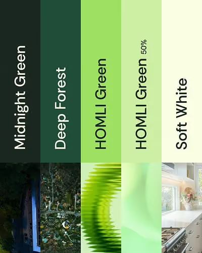
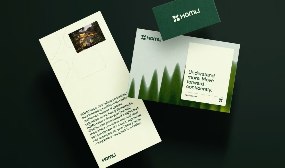
A deep green foundation brings credibility and stability, balanced by softer greens and warm neutrals that keep the brand approachable. Clean typography, generous space and a modular graphic language give information room to breathe.
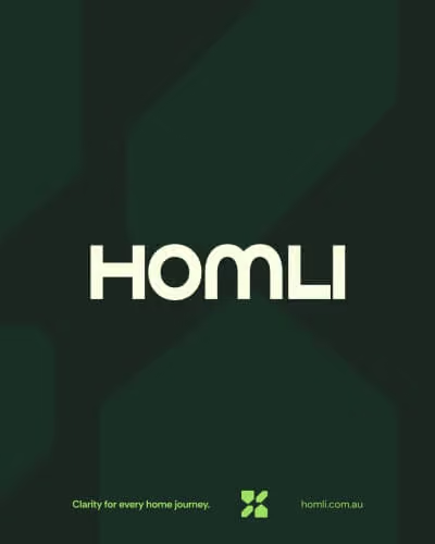
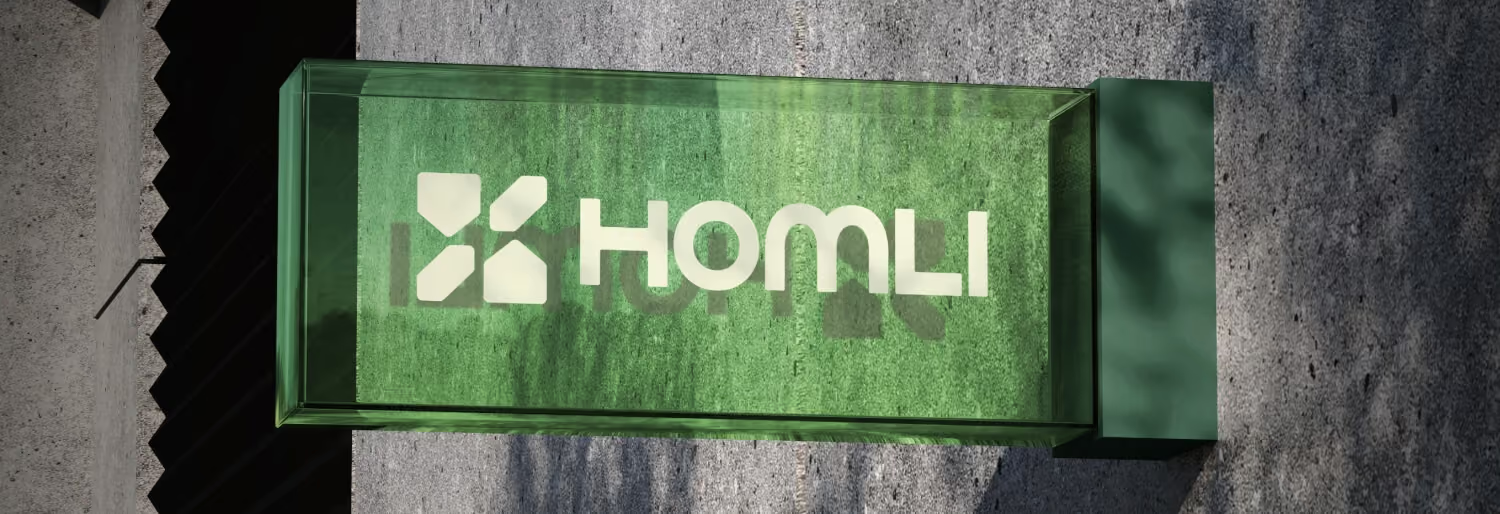
At the centre is a simple geometric brand mark that can work as both a recognisable signature and a building block for the wider visual system.
Professional enough for finance. Human enough for everything that comes with it.

A system designed to guide —
One identity. Plenty of ways forward.
We developed the brand beyond the logo into a flexible system of colour, typography, imagery, graphic forms and messaging.
Photography keeps people and real-life milestones at the centre, while the graphic language introduces movement, pathways and structure without adding more visual noise.
The result is an identity that can shift between education, tools, product information and more emotional moments while always feeling unmistakably HOMLI.
Bringing the brand to the screen —
Because clarity has to work, not just look good.
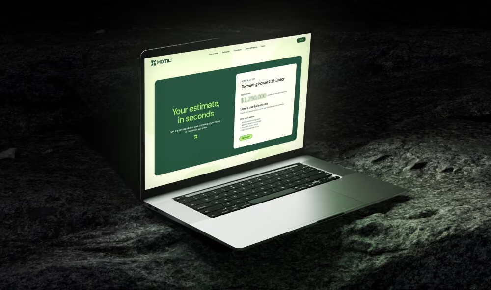
As part of the identity development, we designed the HOMLI homepage to see how the brand would behave in a real digital environment.
The interface translates the same principles into the user experience: clear hierarchy, simple messaging and obvious next steps, with enough personality to make financial guidance feel less intimidating.
It also gave us a practical way to pressure-test the identity beyond a brand presentation, ensuring the visual system could support the digital product HOMLI was being built around.

The Result —
Less financial fog. More forward motion.
HOMLI now has a brand built around the thing it promises its users: making the path ahead easier to understand.
A distinctive identity, a flexible digital-first system and a clear foundation for the brand to grow as the platform does.
No jargon required.